FightMate Branding
Karthik | 2023
The aim of this project was to create the branding for a company called FightMate. Fightmates goal is to teach beginners how to box and ameteurs how to maintain their execises when away from the boxIng gym.In this project I create a brand identity for Fight Mate which in hand leads to many branding decisions.
Logo Design
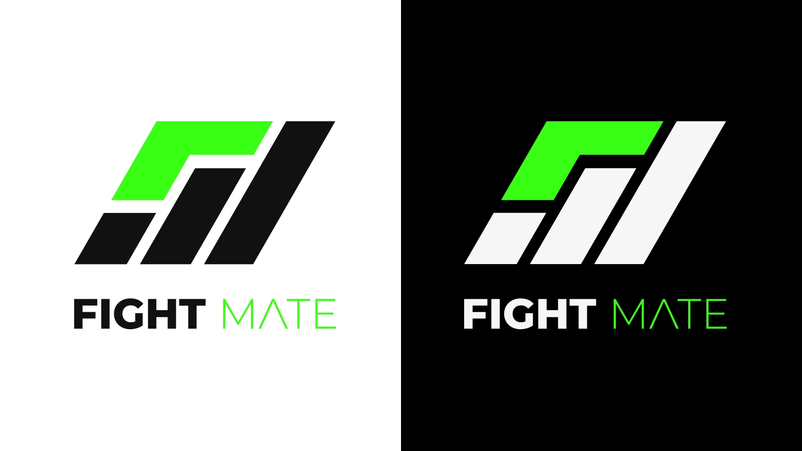
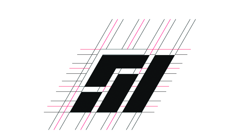
With Fightmate, the challenge was to create a logo that strikes a balance between modernity and minimalism while embodying the idea of fitness. Initially my logos were very literal and involved boxing symbols as it was in older boxing gym logos but I decided to have more modern logo. The logo features three elements at the bottom, representing the letter 'M' for 'mate' and symbolizing growth, reminiscent of an elevating bar graph or steps to climb. These elements collectively form the shape of a fist, a powerful symbol in combat sports. The element on the top left completes the design, subtly resembling the letter 'F' for 'fight.'
Color Palette
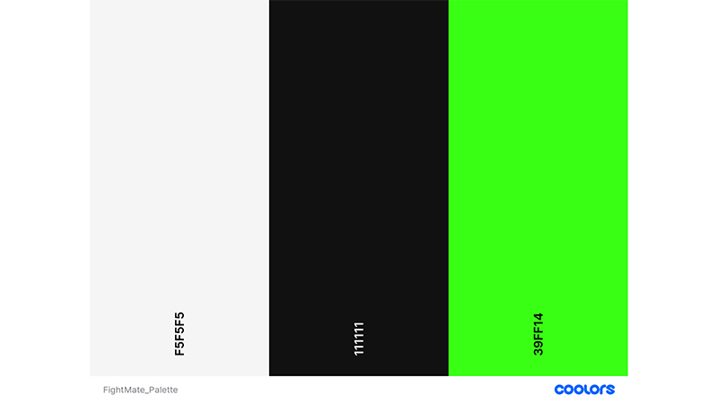
The color palette for Fightmate was selected to ensure optimal visibility and brand identity. Avoiding stark black and white for accessibility reasons, I chose shades that maintain industry standards while infusing still continuing to have the standard white and blacks. The final color selection adds a pop of color, distinguishing Fightmate and aligning with the brands guidelines.
Design Process
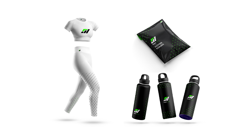
The design process for Fightmate started with comprehensive competitor analysis within the fitness industry, studying various brands and their branding strategies. Moodboards were curated to inspire and guide the design direction, laying the foundation for subsequent research. Then the usual sketching and ideation was conducted before the main branding process. Multiple mockups and patterns were developed after the final.